Y-axis and height metrics
The Y-axis controls what is in each row of the river. The height metric controls how thick each band is drawn. Together they define what you are looking at and the scale to read it on.
What the y-axis represents
Each row is one value of the dimension you group by: one distributor, one product category, one SKU. Pick the dimensions from the Configure gear next to the Y-axis breadcrumb:
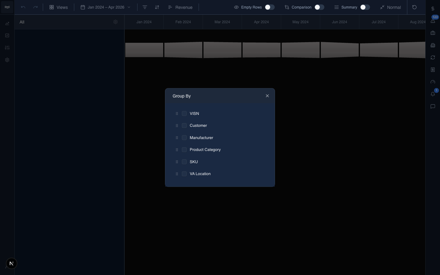
Tick a dimension to add it. Drag the grips to reorder. Pick more than one dimension to layer the hierarchy; for example, Distributor → Distribution Center shows each parent company's accounts as nested rows. The customer hierarchy dimensions (Distributor, Distribution Center, location) and the Channel dimension come from the same place, so any of them can be a river axis.
Up to two dimensions render as visible Y-axis columns. Additional dimensions collapse into a +N chip.
Drilling in and out
Click a cell in the Y-axis to drill into it. The river filters down to that value's contents. The breadcrumbs above the Y-axis show the active path:
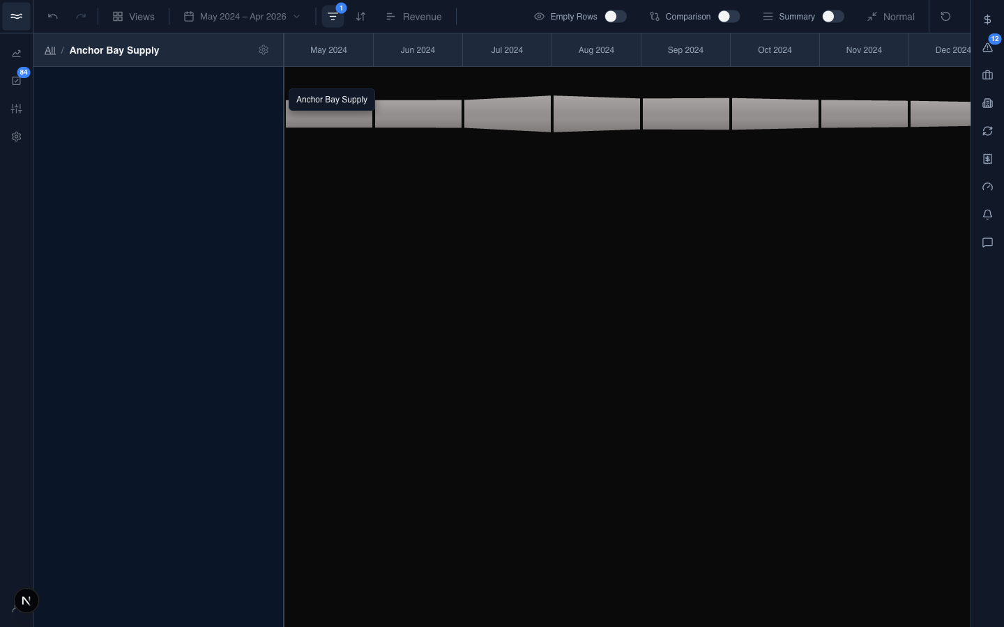
Click a breadcrumb segment to step back, or All to reset to the top. Drilling is also available from a band's right-click menu. Filters applied from elsewhere appear as removable chips in the same bar.
Choosing a height metric
The toolbar's Height button picks what each band's thickness represents:
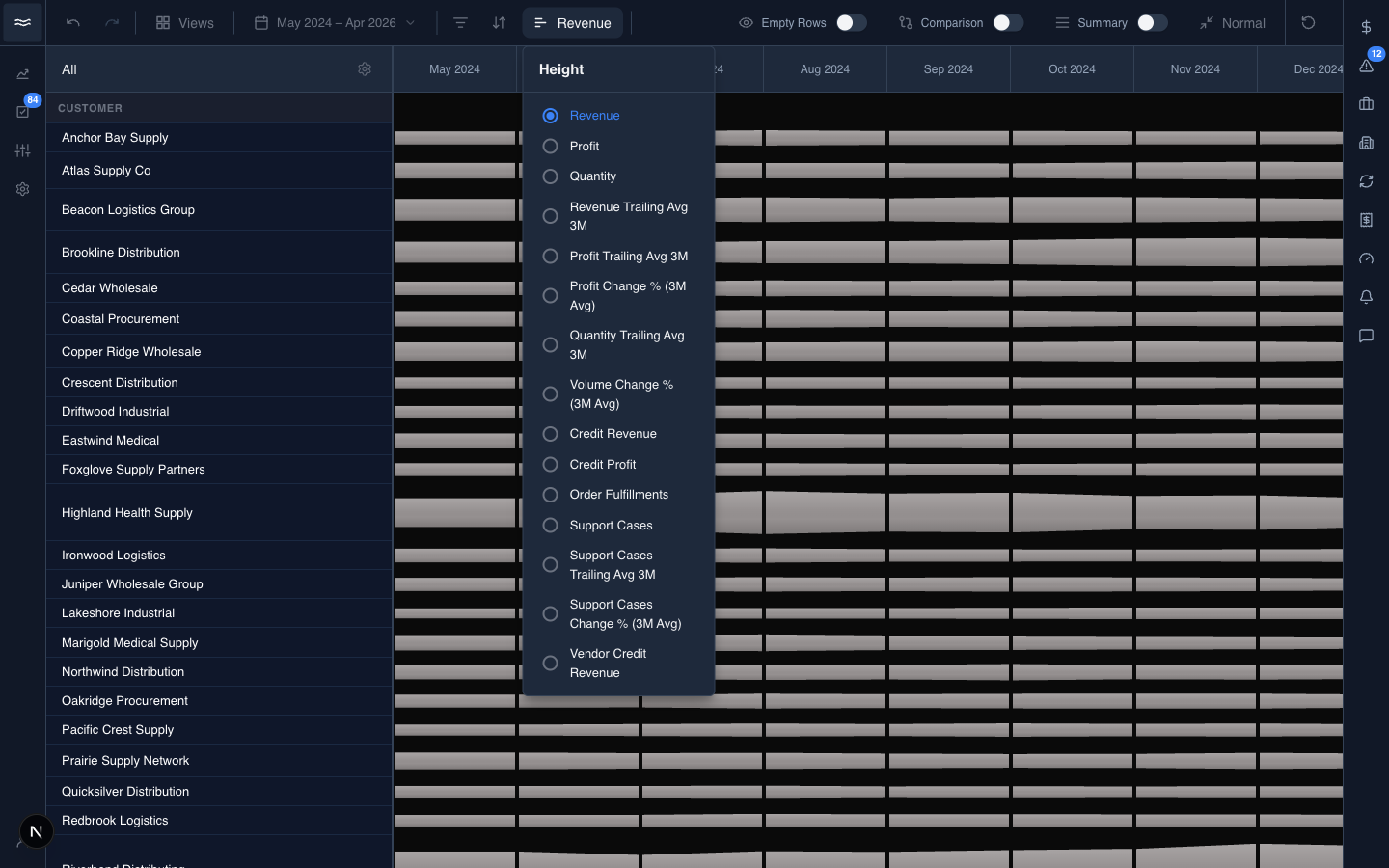
The options are your org's measures (revenue, profit, quantity, support cases, and custom measures), filtered by your role's permissions. Thickness is normalized across the whole canvas: the tallest band sets the scale, and every other band is drawn in proportion to it. Switching the metric reflows the entire river.
For lower-is-better measures, such as support cases, the growth and decline colors flip so that growth reads as bad.
Resizing
Drag the right edge of the Y-axis panel to widen or narrow it. Long labels that do not fit appear in a hover card.