Dashboards and Charts
Dashboards are saved layouts of charts. Use one when you want a recurring view of several measures together, such as AR aging, top accounts, or manufacturer mix. Charts exist independently of dashboards, and one chart can sit on any number of dashboards.
Browsing dashboards
Open Dashboards from the main nav:
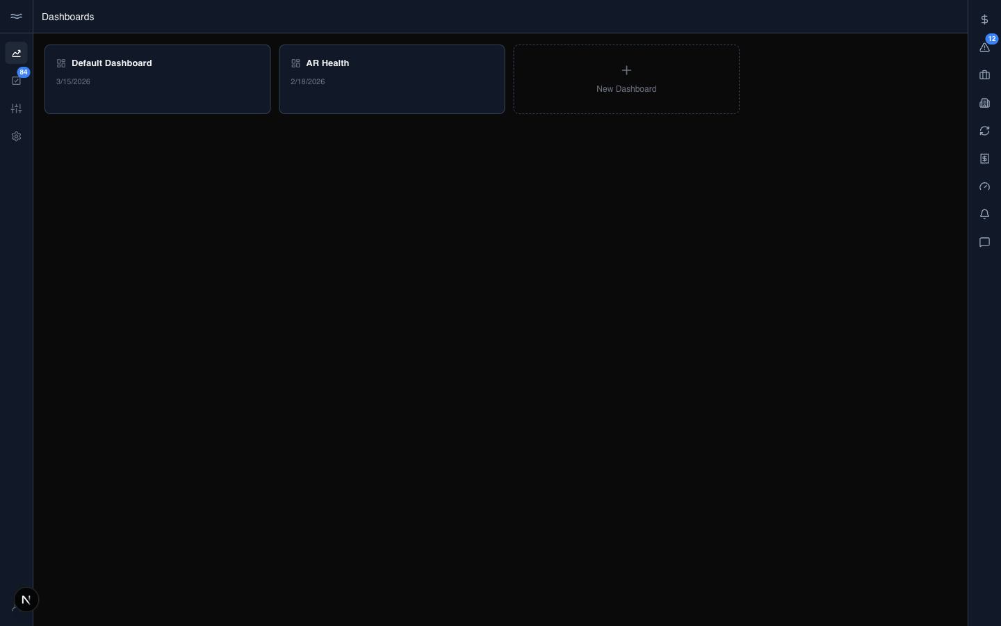
Each card shows the dashboard's name, description, and last-updated time. The dashed New Dashboard card creates a dashboard: type a name and press Enter. One dashboard is the org default, marked with a Default pill in the switcher. The default dashboard cannot be deleted, and there is no UI to assign the default to another dashboard.
Building a dashboard
Open a dashboard to see its grid:
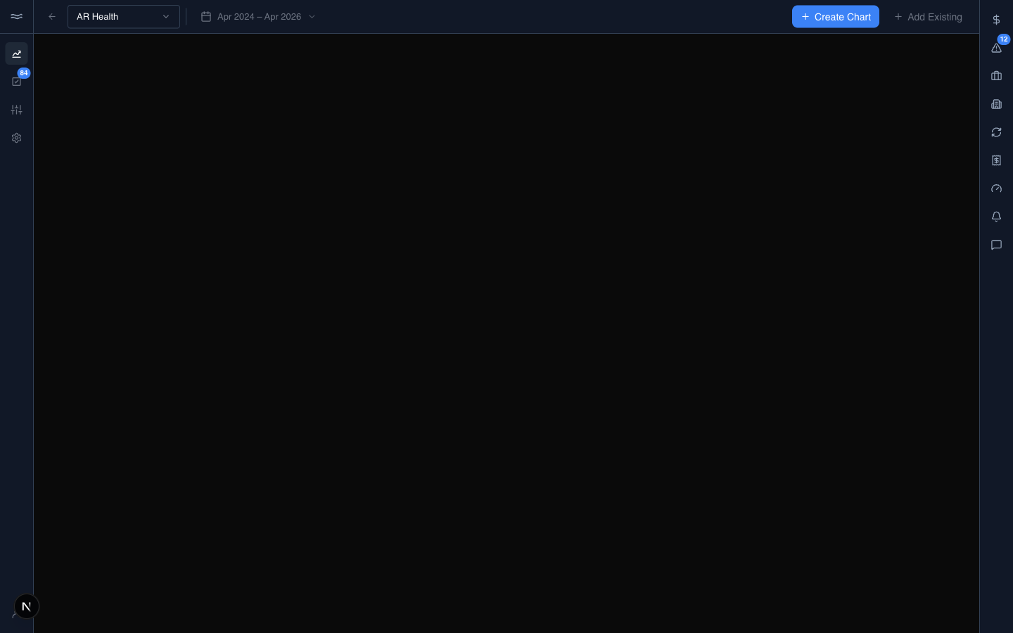
The header contains a back arrow, the dashboard switcher (jump between dashboards, or create, rename, or delete one), a date-range picker that scopes every chart on the grid, and the + Create Chart and + Add Existing buttons.
Charts are arranged on a grid. Drag a chart by its header bar to move it. Drag the corner to resize it. Each chart header also has refresh, expand, and remove buttons. Click the chart body to open the chart's detail page. Cards render their last snapshot immediately, then replace it with live data.
+ Add Existing opens the chart picker: searchable thumbnails of every saved chart, each tagged Builder or AI by origin. Select one or more charts and click Add Selected. Charts already on the dashboard show a check.
Building a chart
+ Create Chart opens the builder:
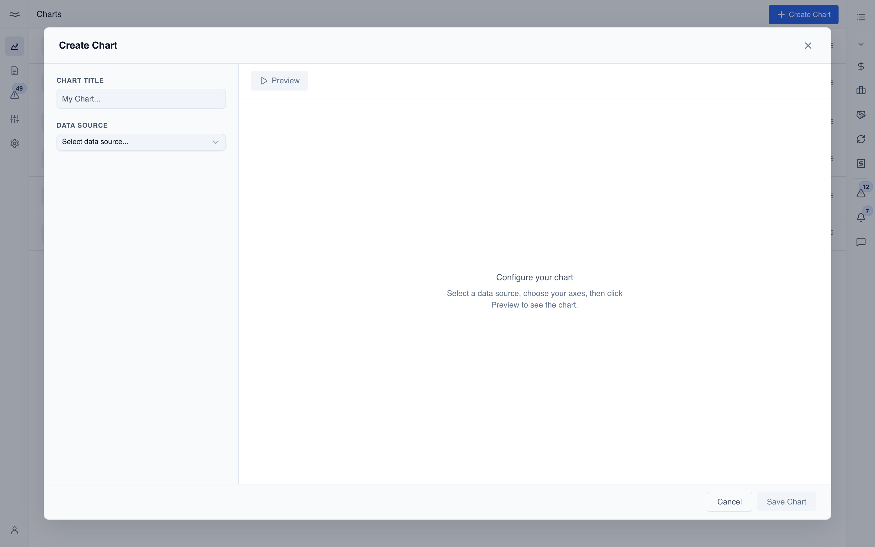
- Data source: the metric view to query (sales, credits, cases, fulfillments, deals).
- Axes: the X axis (usually time, with a bucket), one or more Y measures, and an optional group-by.
- Chart type: Bar, Stacked Bar, Line, Area, Pie, or Donut.
- Filters: the same dimension picker as the river, applied before the chart computes.
Click Preview to render the chart on the right before you save.
Chart detail
Open a chart (from a dashboard card's body or from the picker) to see its detail view:
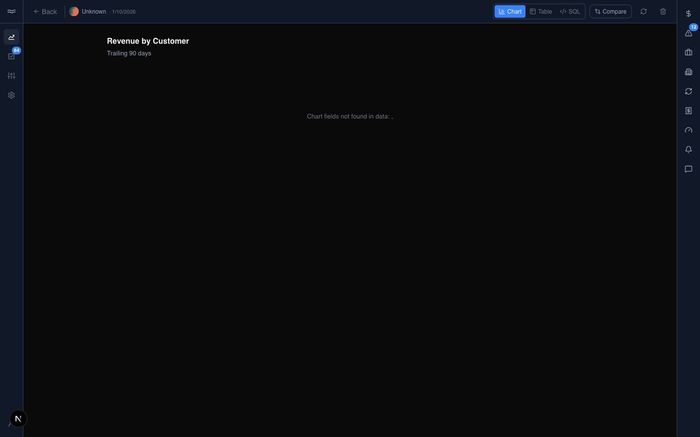
Use the toggle to switch between the Chart, Table, and SQL views. Compare opens a second chart side by side. The refresh icon re-runs the underlying query. The trash icon deletes the chart.
The Edit button appears only on charts built in the form builder. AI-generated charts (from the River Assistant) can be viewed, refreshed, compared, and deleted, but not edited. To change one, rebuild it or ask the assistant for a variant.