Toolbar and Views
The toolbar holds every control that shapes what the river shows: time, scale, colors, filters, overlays, layout, and saved views. Every setting is stored in the URL, so you can copy the address bar to share an exact view.
Below the toolbar, a one-line params bar states the current configuration in plain language, for example Now displaying Revenue grouped by Distribution Center colored by change vs the same month last year. If a view looks wrong, read that sentence first.
Undo and redo
The two arrows on the far left step through your recent river states (⌘Z / ⌘⇧Z). Every change (measure, grouping, filter, date range, drill, or baseline) is one step, so you can undo an accidental drill or filter with one click.
Saving, sharing, and reusing views
The Views button holds your saved views:
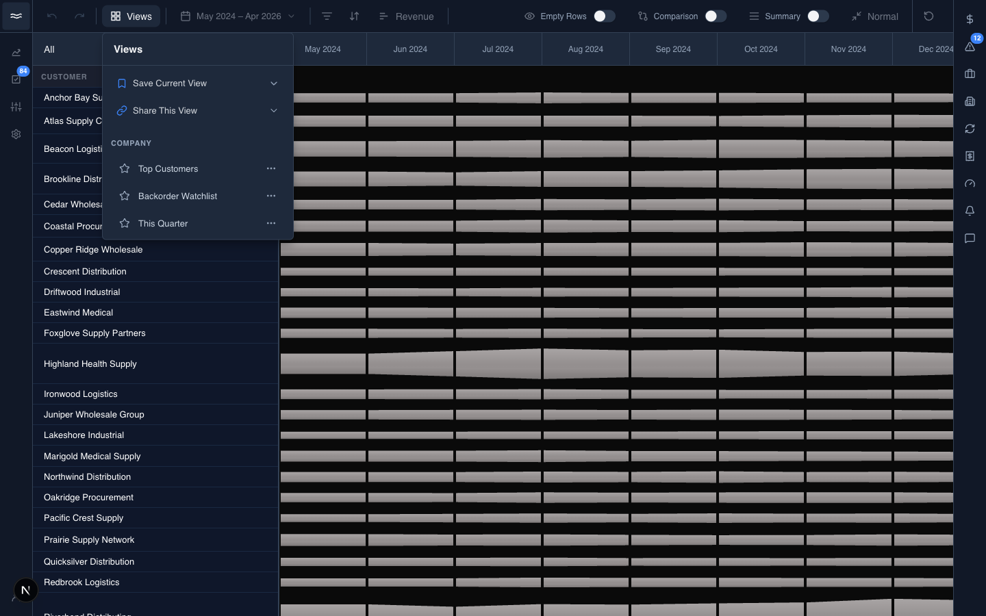
- Company and Personal sections: click a view name to load it. The star sets a view as your default. The
…menu offers Rename, Update to current view, Duplicate, and Delete. - Save Current View: save the current toolbar, Y-axis, and filter state under a name, personal or company-wide.
- Share This View: copy a link that reproduces the exact view.
- Download as CSV: export the data behind the current river.
A saved view is a URL snapshot. Loading one rewrites every toolbar control at once. The reset button at the right edge of the toolbar returns to your default view.
Setting the date range and color baseline
The date range button opens a calendar with one-tap presets and the color baseline controls:
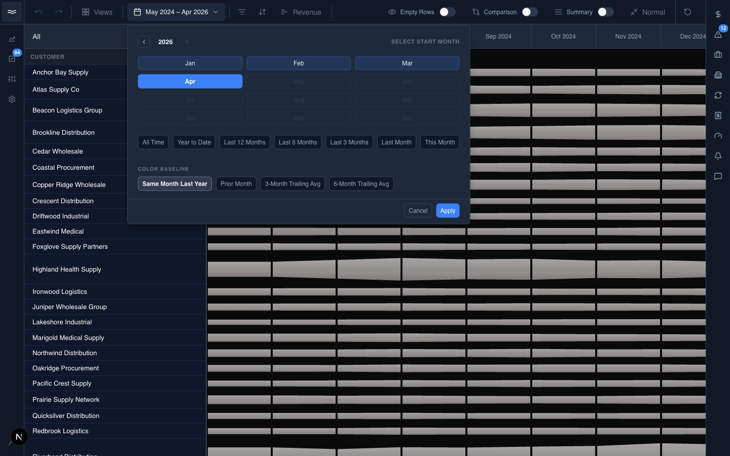
- Range presets: All Time, Year to Date, Last 12 / 6 / 3 Months, Last Month, and This Month. Or click two months to set a custom range.
- Color Baseline: what segment colors are computed against. Choose a specific month back (12 months = same month last year, the default; 1 month = prior month), a trailing average over a window you pick, or Current, which turns color coding off.
- Adjust Thresholds: expand this section to tune the percent-change cutoffs and colors for the Small/Large Decline and Small/Large Growth buckets, plus the small-account cutoff used by Group Small Accounts. Save as Default persists the settings for the org. Requires the thresholds permission.
Filtering the river
The Filter button narrows which bands appear. Each dimension has a section with selectable chips and an Add... box that accepts typed values with suggestions:
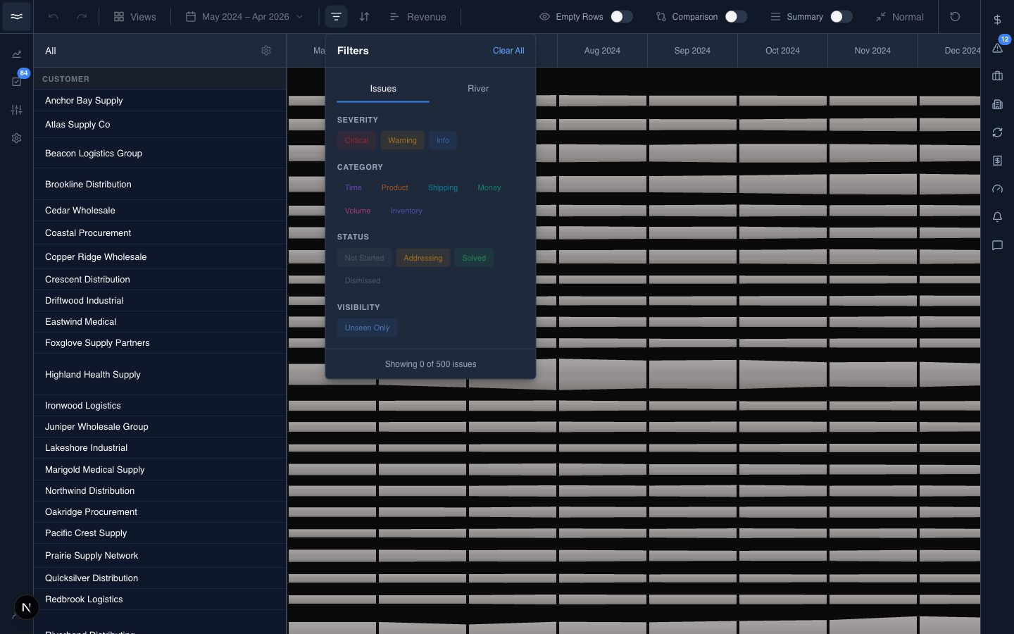
This popover filters the bands themselves. The issue and deal markers drawn on top of the bands are controlled by the Icons button, described next.
Icons: issue pills and deal badges
The Icons button controls the marker overlays on the canvas. Selecting chips places markers on the river; clearing them removes the overlay. There is no separate on/off switch:
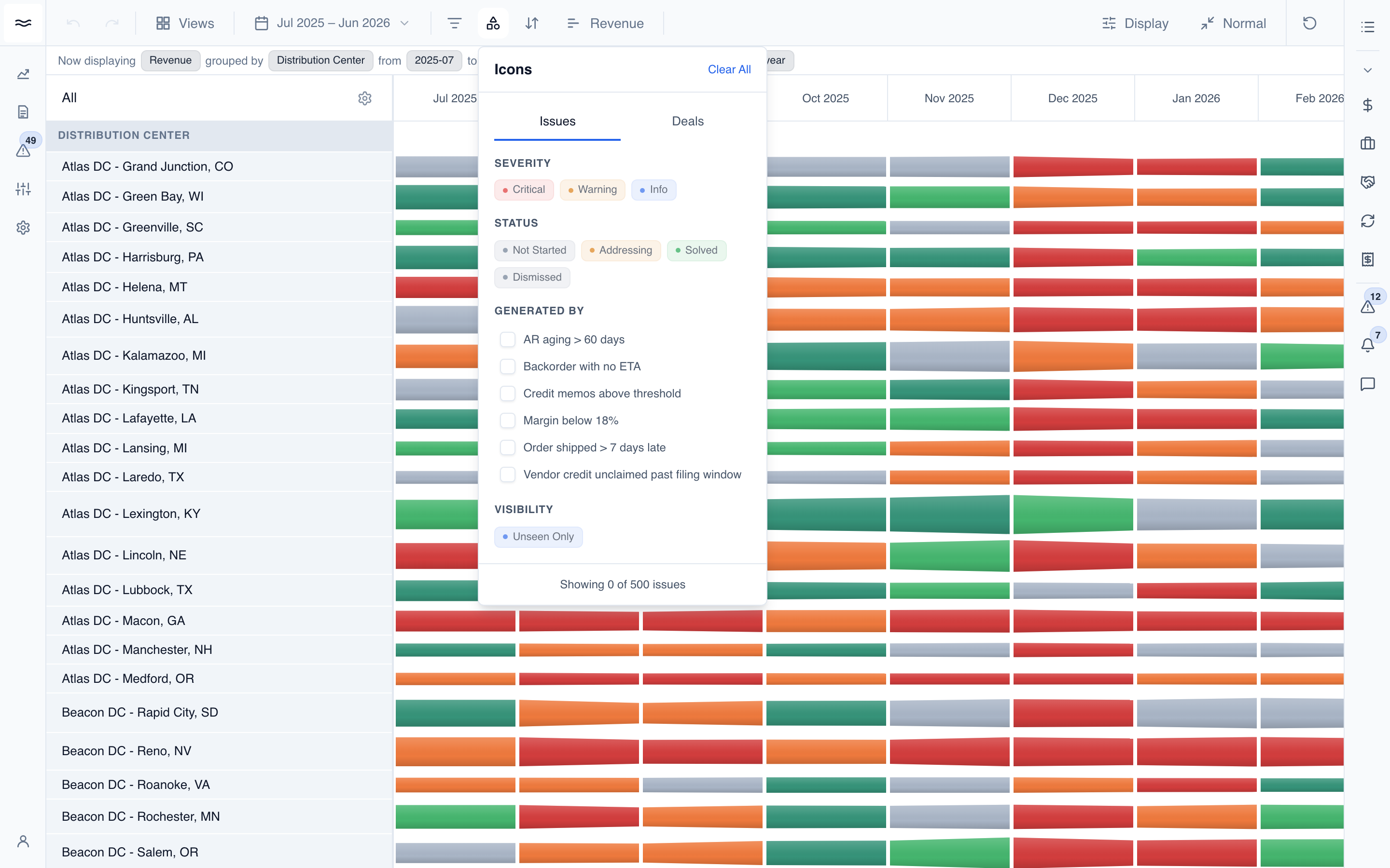
- Issues tab: Severity (Critical / Warning / Info), Status (Not Started / Addressing / Solved / Dismissed), Generated By (rule names), and an Unseen Only chip.
- Deals tab: Stage and Owner chips. Selected deals pin to their opening month on the bands they match. Groupings that a deal cannot be mapped to show no deal icons.
The badge on the button counts the active selections across both tabs.
Sorting the rows
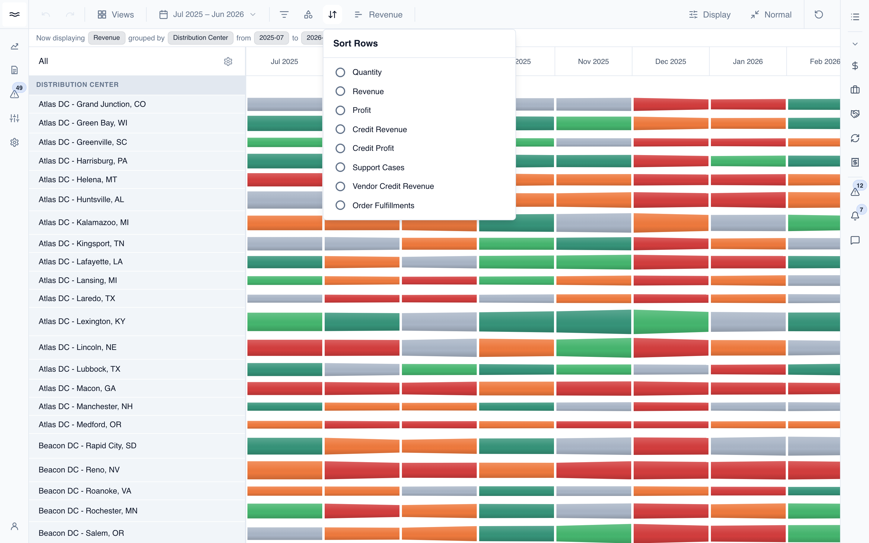
The Sort button reorders the bands by any measure you have access to, highest first by default. Click the selected option again to return to the default order. Right-click an option to switch between Highest First and Lowest First:
Choosing a height metric
The Height button picks what each band's thickness represents:
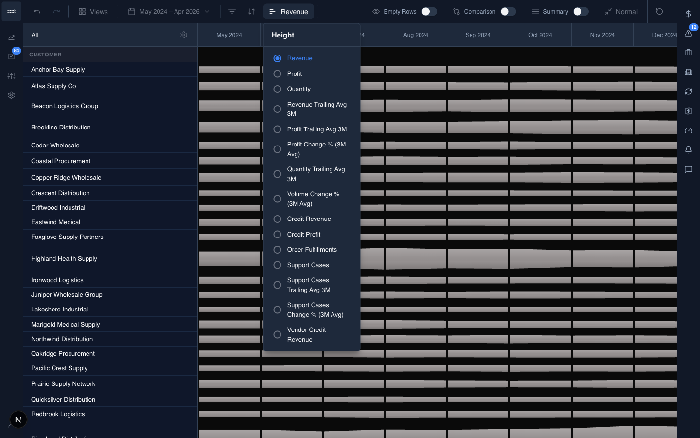
The list comes from your org's measures, filtered by your role's permissions. If a measure is not visible, you do not have access to it. Switching the metric reflows the entire river to the new scale.
Display options
The Display popover collects the layout toggles:
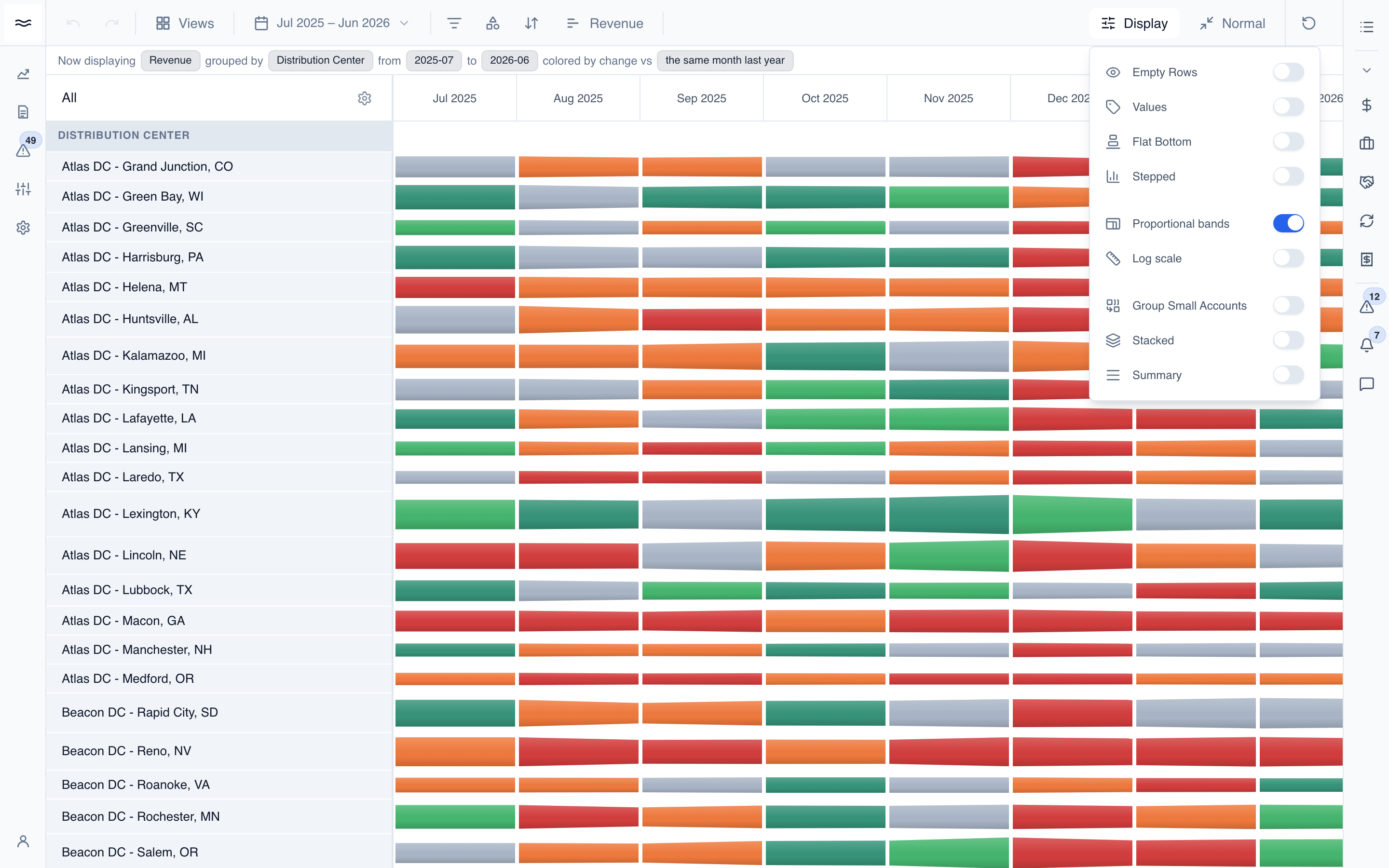
- Empty Rows: show or hide bands with no activity in the range.
- Values: print the metric value on each segment.
- Flat Bottom / Stepped: alternative band silhouettes.
- Proportional bands / Log scale: alternative thickness scaling.
- Group Small Accounts: collapse bands under the cutoff percentage into one combined band. Available with a single grouping. The cutoff is set in Adjust Thresholds.
- Stacked: draw the bands stacked into one river instead of separate rows.
- Summary: show a totals row at the bottom of the canvas.
Some toggles disable each other. For example, Compressed mode turns off Values and Stepped, and Stacked turns off Proportional and Log scale. Disabled rows explain why.
View modes
The view-mode button on the right switches the layout itself:
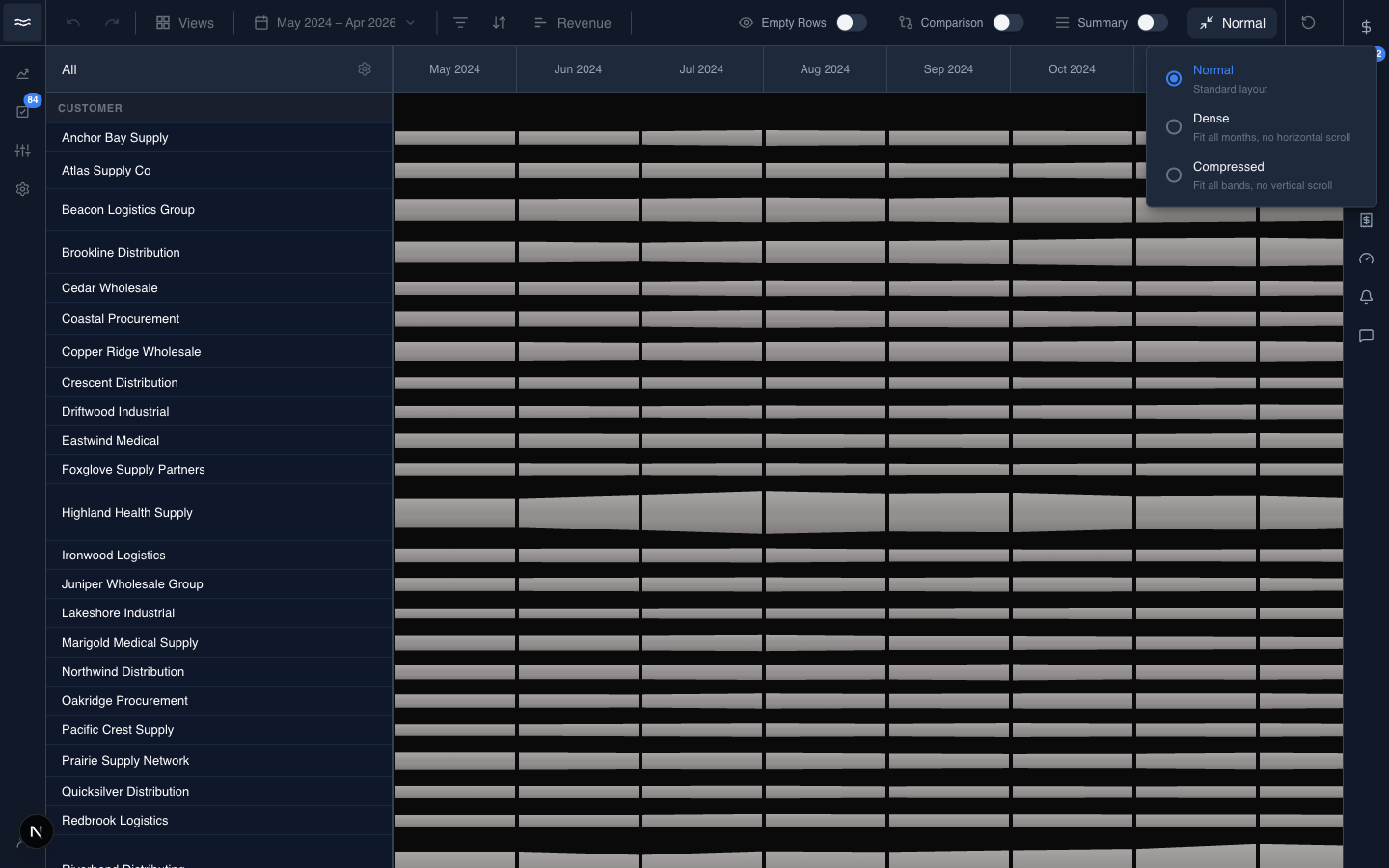
- Normal: standard layout.
- Dense: fit all months in the viewport, with no horizontal scroll.
- Compressed: fit all bands in the viewport, with no vertical scroll.
The control locks to Normal while Comparison is on.
Comparison
Comparison is part of the date range button. Switch to the Compare tab at the top of the picker:
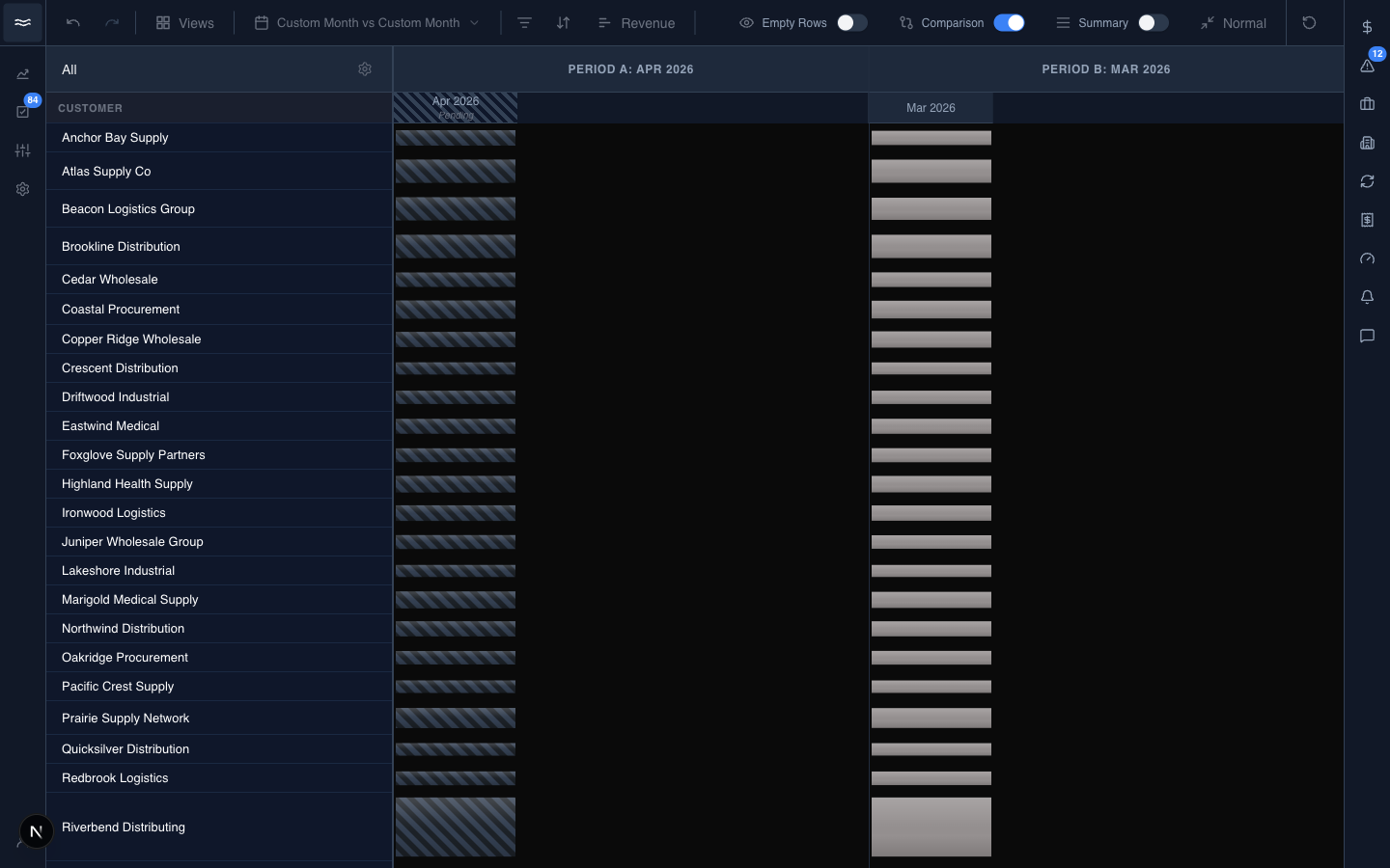
Pick a comparison type (Month vs Prior Month, Month vs Same Month Last Year, Month vs Trailing Average, Custom Month vs Custom Month, or Custom Period vs Custom Period), then adjust the Period A / Period B pills. The canvas splits into the two periods side by side. Only the periods themselves are stored in the URL, so the exact preset name does not always survive a reload.